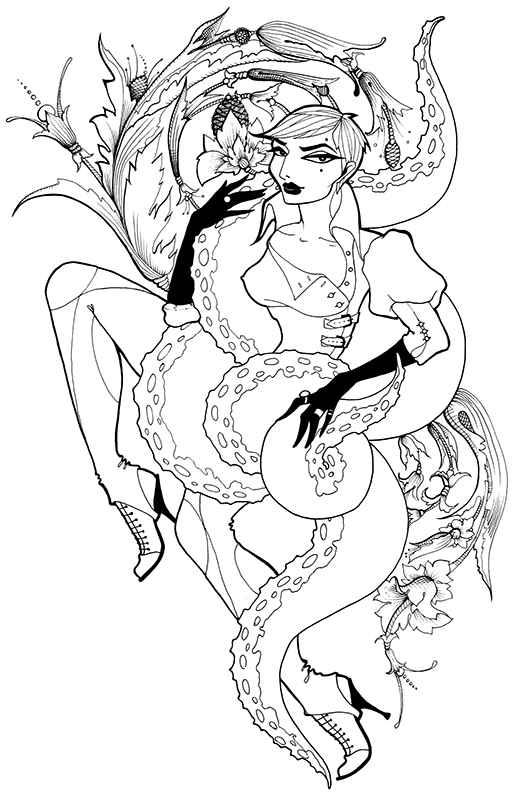
Just finished this up yesterday and am fairly pleased with it. A peek into my tattoo design process: it’s going on the client’s upper arm, so I requested a photo of the exact area and created a digital mockup before drawing anything – the idea here is that the piece will cover most of the upper arm and the legs and filigree will wrap around a bit. The mockup is too hideous to show you, though.
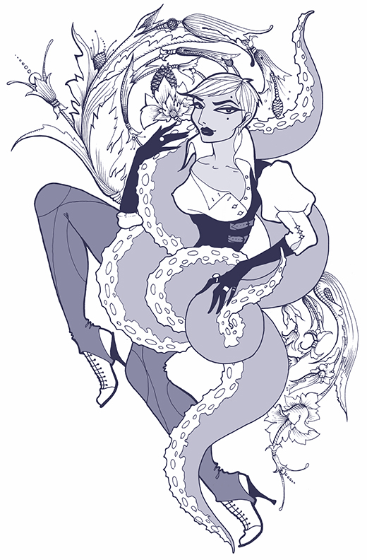
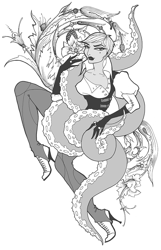
Below are two possible color variants, and the original ink. Client seems to be leaning toward the violet at the moment, as am I.


The detailed filigree work around the top and bottom is lovely, and I agree that it seems to look nicest in the violet/blue tones. Is it meant to look like Erin O’Connor? Because even if it isn’t, it still looks rad, and Erin is beautiful.
She was a figment of my imagination, Typhoid, but I see the resemblance now! And yes, Erin is gorgeous.
SG is so deeply instillating my soul I have the feeling to see Manko !
Personally I have reservations about carrying another artist’s work on my skin and yet I would think twice if I could have a tattoo designed by you. Absolutely brilliant.
Dwam – you know, I love Manko’s look! But it wasn’t intentional.
Leyla – a big mushy thank you, that’s a huge compliment! Made my day.
Great look! I love the image. Just came across this site, and I like what I see.
Awesome! I would LOVE to have a piece by you tatted on me one day! Lovely work! <3
My thoughts are exactly as Widdlesh!